The Pathway Tools Omics Dashboard
Introduction
The Pathway Tools Omics Dashboard is a tool for visualizing omics
data. It facilitates a rapid user survey of how all cellular systems
are responding to a given stimulus. It enables the user to quickly
find and understand the response of genes within one or more specific
systems of interest, and to gauge the relative activity levels of
different cellular systems. The dashboard also enables a user to
compare the expression levels of a cellular system with those of its
known regulators. To learn more about how to use the Omics Dashboard,
watch the series of Omics
Dashboard Webinar videos at the BioCyc website. To try out the
Omics Dashboard on some sample datasets, see the Omics Dashboard page on
the BioCyc website.
The dashboard consists of a set of panels, each representing a system of
cellular function, e.g. Biosynthesis. For each panel, we show a graph
depicting omics data for each of a set of subsystems,
e.g. Amino Acid Biosynthesis and Carbohydrates Biosynthesis. Each
panel has its own y-axis, so that omics data for the different
subsystems within a panel can readily be compared with each other.
Multiple timepoints or experimental conditions are plotted as
separate data series within the graph.
Clicking on the plot for a given subsystem brings up a
detail panel, breaking that subsystem down further into its component
subsystems. At the lowest level, the values along the x-axis
correspond to the individual objects in the dataset (i.e. genes for
gene expression data, metabolites for metabolomics data, etc.).
Panels whose x-axis labels are subsystems (e.g. pathways, pathway
classes, other functional groupings) that combine data from multiple
genes, reactions or metabolites are referred to as composite
panels. Panels for which each x-axis label represents a single gene,
metabolite, etc. are referred to as base panels. The two types
of panel have different display styles and options.
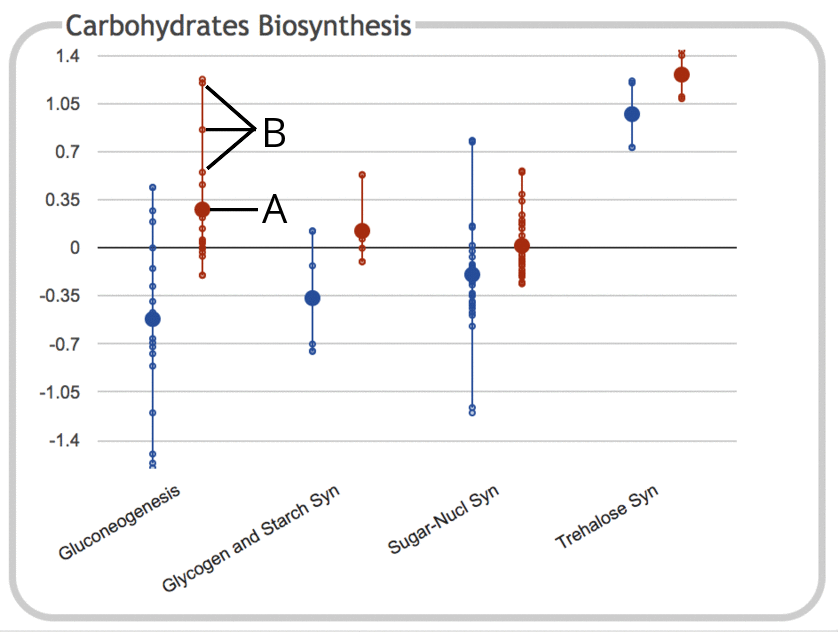
The following illustration depicts the Carbohydrates Biosynthesis
subsystem panel for a gene expression experiment
containing two timepoints (values depicted here are log ratios
relative to control):
|
- The large dot represents the average (mean) of all data values for objects
(e.g. genes) belonging to that subsystem. In this case, the subsystem
is the Gluconeogenesis pathway, and the data values are for the
second timepoint. Genes that belong to the subsystem but which do not
have values in the provided dataset are ignored and not included in
the average. If the dataset consists of only a single timepoint, then
the numeric value is also drawn on the chart, but this is omitted for
legibility reasons when there are multiple timepoints or
experimental conditions.
- Each of the small dots represents a data value for an
individual gene within the subsystem. The line connecting them
shows the full range of values for that subsystem. Different subsystems
contain different numbers of genes, so the numbers of small dots
will vary accordingly.
Mousing over the plot for a given subsystem shows a
tooltip that lists the full name of the subsystem, along with the number of
values for each timepoint and their average values.
|
|
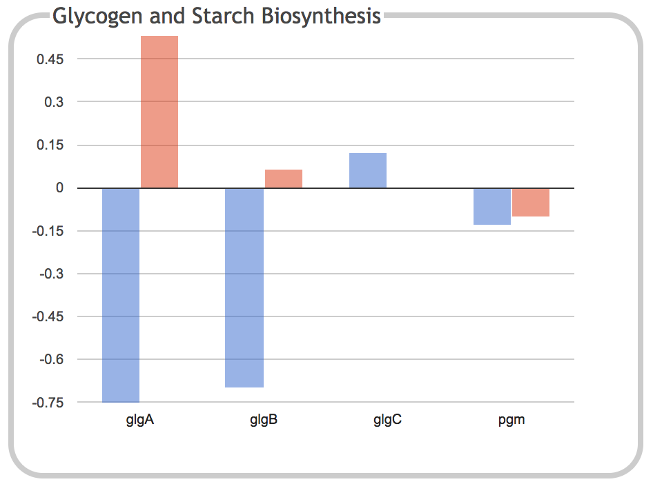
This illustration is the result of clicking on the Glycogen and Starch
Biosynthesis component of the previous panel. It shows a bar graph
depicting the expression levels of each individual gene within the
subsystem for the two timepoints.
Clicking on a gene name or one of its corresponding bars will navigate
to the page for that gene. When the dashboard is invoked from a
Pathway Tools web server such as the BioCyc website, this page will
open in a new browser tab. When the dashboard is invoked from Pathway
Tools operating in desktop mode, the gene will be shown in the main
Pathway Tools Navigator window.
If the subsystem represents a
metabolic pathway or collection of related metabolic pathways, the
panel header will include a "Show Pathway" button to show the pathway diagram
overlaid with omics data (if the initial color range for the omics data is not a good match for the diagram, you can change it using the "Update Color Scheme" command in the Options menu of the pathway diagram panel). The "Show Operons" button generates a
diagram that shows how the genes in the subsystem are organized on the
genome and, where available, their regulatory influences.
|
General Usage Instructions
Typical usage of the Omics Dashboard might entail the following steps:
- Prepare data for upload, ensuring it is in correct tab-delimited
format (spreadsheet files in Excel format will have to be exported to
tab-delimited text), and any desired statistical manipulations have been performed.
- Upload the data file.
- Organize the display. If the data contains multiple replicate
sets, you will want to organize the data columns into replicate
groups. If the data contains one or more significance columns, you
will want to hide them from view. See the section on DataColumn Selection and Grouping. Apply any
desired filtering options. You may also wish
to update the title and column labels to make the display more readable.
- Survey the overall behavior of all top-level systems. You may
wish to adjust various display preferences and
scaling to make differences and changes more apparent.
- Select a subsystem to investigate in more detail, either because
it is of intrinsic interest to you or because the top-level display
has indicated it might be of interest, and click on
it (see Introduction; if your dataset contains significance columns, you may prefer to
use enrichment analysis results
to identify interesting subsystems). Continue to identify interesting subsystems and drill down
further until you reach a base panel, adjusting scaling and sorting
parameters as desired.
- From a base panel display, view pathway and/or operon diagrams
(see Introduction) and, where available, explore regulatory
influences. Click on individual genes or other objects to bring up
their detail pages in a new tab.
- Repeat with another subsystem of interest.
Importing Data
The Omics Dashboard uses the same tab-delimited input file format as
the Pathway Tools Omics Viewer. It is described, with examples, in
the Pathway
Tools Website User's Guide. The first column must contain object
(e.g. gene or metabolite) names or identifiers (see userguide for
acceptable options), and there must be one
or more additional columns containing numeric data. Multiple data
columns can represent time series datapoints, multiple replicates,
and/or different sets of experimental conditions. As a practical
matter, for performance and display reasons, it is best to keep the
number of data columns under about 20. Because the
dashboard can accommodate multiple types of data, you will be asked to
provide some basic information about your datafile, such as the type
of objects in the first column, which columns contain the numeric data
of interest, and whether that data is absolute (e.g. counts,
intensities) or relative (i.e. ratios or log ratios relative to
control or some other condition), and if relative, whether the data is
centered upon 0 or 1. Beyond those basic parameters, the dashboard
does not impose any additional interpretation on the supplied
numerical values, so it is important that any desired statistical
analyses or corrections, such as normalization, significance analysis and/or
filtering, be applied before the data is uploaded to the dashboard.
If any data columns have corresponding columns containing significance
values, those significance columns should be included in the list of
uploaded columns like any other (after the upload, you will have a
chance to associate each significance column with its corresponding
data column).
In addition to traditional omics datasets that contain a single class
of data (i.e. transcriptomics or metabolomics or proteomics), the
Omics Dashboard also supports multi-omics data. For example, it can
generate a display combining both transcriptomics and metabolomics
data generated as part of the same set of experiments. The different
classes of data are submitted as separate files or SmartTables, each
with its own parameters as described above. Alternatively, a single
file can be generated containing each component dataset along with a
section containing the parameters for each dataset, and that file can
be uploaded to the Omics Dashboard. Multi-omics datasets containing
either two or three different component datasets can be
accommodated. If two datasets are supplied, each will be displayed
with its own y-axis (one on the left, the other on the right). If
three datasets are supplied, then two of them must share a y-axis, so
you may wish to normalize the data before upload. The Display
Preferences panel lets you customize which axes to use for which
datasets.
The Omics Dashboard is accessible both from a website powered by
Pathway Tools (such as BioCyc.org), and from Pathway Tools running as
a desktop application. From a Pathway Tools website, use the Omics
Dashboard command in the Analysis menu to access the data upload page. In lieu
of a tab-delimited file, a SmartTable of similar format may also be
used as an input data source (examples are provided). In the desktop
application, use the Omics Viewer command in the Overviews menu, and
select the Omics Dashboard as the target viewer.
Display Preferences
Global display preferences can be set using the Display Preferences
panel at the right of the screen. Display preferences for an
individual panel, which override the global defaults, can be set using
the controls associated with each panel. For the top-level panels,
these are displayed at the bottom of each panel. For pop-up panels,
the controls are located in the panel header.
Show Sums/Counts
In addition to the average of data values within a subsystem, the
dashboard can also show the sum of all data values within the
subsystem. Because different subsystems have different numbers of
genes, for RNAseq data, this sum can indicate the relative proportion of
cell resources that are being invested in each subsystem. For other
data, showing the sum of all data values can highlight cumulative
trends that might be masked by otherwise small changes in averages.
|
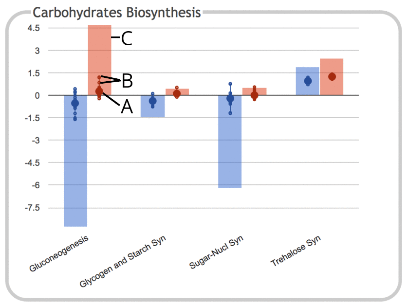
This illustration shows the same panel as above, but with the "Show
Sums" option enabled.
- As before, the large dot represents the average (mean) of all data
values for genes belonging to that subsystem. However, because
sums are now being shown, the vertical scale of the graph has been compressed.
- Each of the small dots continues to represent a data value for an
individual gene within the subsystem, with a connecting line showing
the range of values.
- The height of the colored bar corresponds to the sum of all data
values for objects in the subsystem. Since these values are log
ratios that can be either positive or negative, the sums can also
be either positive or negative (for RNAseq data, the values would
be expected to all be positive).
|
Sorting
There are multiple options for sorting the various subsystems and data
objects within a given panel. By default, composite panels (those
whose components are subsystems) use a predefined ordering (which you
can customize). Base panels default to sorting
by map position when the data objects are genes, and otherwise are
sorted alphabetically. The defaults for the two types of panels can be
changed by selecting new defaults in the Display Preferences panel.
The sorting option for any individual panel can be changed by clicking
on the sort icon for that panel.
In addition to sorting alphabetically, by map position (where
appropriate) or using the predefined ordering, plots within a panel
can be sorted numerically. However, when there are multiple data
series (e.g. timepoints), and multiple data values within a series
(e.g. genes per subsystem), the question becomes how to determine
which numeric value should be used for sorting. For composite panels,
we support two ways to aggregate data values within a series: by
taking the average (the mean, corresponding to the large dot), or by
taking the sum (the height of the bar when sums are being shown).
To aggregate across multiple data series, four options are available:
- Average value
- Difference between maximum and minimum value (Change)
- Maximum value
- Minimum value
Since in every case one can sort in either ascending or descending
order, that means that for composite panels with multiple data series,
there are 4x2x2=16 possible numeric sorting options.
Scaling
There are three possible ways to adjust the vertical scaling of a
panel. The first is by clicking on the magnifying glass icons for
a panel to increase or decrease its total height. There is a
smallest possible height and a maximum possible height (the full
height of the window). Depending on the size of your browser window,
there may or may not also be one or more intermediate height settings.
For datasets in which all data values are absolute measurements
(i.e. not ratios) and positive values (e.g. intensities, counts,
concentrations), you can specify whether to use a linear or
log10 scale for the y-axis (for relative datasets, the
decision to use a log scale or not is predetermined and cannot be
overridden). The default is set in the Display Preferences panel, but
can be changed for any panel by clicking the log checkbox. Note that
when using a log scale, the only y-axis labels shown will be powers of
10.
Finally, there may be cases in which one or more outlier values cause
the entire vertical scale of a panel to become compressed to the point
that it is difficult to distinguish differences in the portion of the
scale where most of the data is. In that case, you can manually
adjust the graph extrema to limit it to the desired extent, causing
any values that fall outside those extrema to be omitted. To do
this, either select the Change Graph Scale command from the Options
menu for the panel, or click on one of the y-axis labels to bring up
the relevant dialog. Use the slider to adjust the scale extent and
click the Set button to update the panel accordingly. Use Reset to revert to the default scale.
From this dialog you may also set an exact numerical height and width for the graph, and adjust both horizontal and vertical scale that way.
The font sizes used for the panel axes can be adjusted using the font icons and to increase or decrease size respectively, or can be set globally in the Display Preferences panel. Note that if you set the font size too large, axis labels that don't fit may be truncated.
Data Column Selection and Grouping
Note on terminology: a data series can refer to either a single data
column or a grouped set of replicate columns. We use the terms data
column and data series more or less interchangeably in this document.
When there are multiple data series, the Data Column Selection panel allows
you to selectively show only those you are interested in at the
moment. It also allows you to edit the labels for each data series
to change how they appear in the legend near the top of the screen,
and to change the color associated with each data series. To change
the order in which the data series are displayed, click and drag the
corresponding labels.
Some datasets contain multiple replicates for each timepoint or
experimental condition. Rather than showing each of these as a
separate data series, you can opt to automatically group them together
and average the values for each gene or metabolite in the replicate
set. In the Series Grouping panel, specify how many total replicate
groups should be generated. For example, if a 12-column dataset
has data for 4 experimental conditions with 3 replicates each,
you would specify 4 groups. At this time, for performance reasons,
the maximum number of groups that can be created is 10. When you
click OK, a table is generated that enables you to assign data columns
to groups by clicking the appropriate radio button. The groups are
initially labeled G1, G2, etc. but you can rename them. For data
columns that do not belong to any group, select N/A. Each data column
can be assigned to at most one group.
Creating or updating groups will cancel any previous selection made using
the Data Column Selection panel, and that panel will be updated so that you
can select which groups to show instead of which individual data
series.
When the data is divided into replicate groups, base panels are no
longer drawn as simple bar charts. Instead, the averages and values for the
individual replicates are displayed as if the panel were a composite
panel.
The ability to group multiple replicates is not available when
displaying multi-omics data, so replicate data for multi-omics datasets
will have to be combined and averaged before upload.
Data Filtering
Data can be filtered to highlight only those datapoints that are of
particular significance. Any objects (genes, metabolites) that do not
pass all filters for at least one visible data series are omitted from
the display. Objects that do pass the filters for at least one series
are included in the display for all data series, including any for which
they do not pass the filters.
Three types of data filters are available:
- Filter by Data Value. A threshold value is specified. Only data
values (or absolute values of data values) that are either less than
or greater than (user-specified) the threshold will pass the
filter. A typical example of when this filter might be used is if
the data values represent fold changes, and you want to filter out
objects that do not change very much over the course of the
experiment, i.e. only keep data where the absolute value of the fold
change exceeds the threshold.
- Filter by Significance Value. Many datasets include both
data columns and p-value or significance columns. Typically you will
want to hide the significance columns from the regular display
(via the Data Column Selection panel), but use them for data
filtering so that only objects that pass the significance threshold
for at least one data series are shown. For each data series,
specify which data column contains the significance value for that
series, along with the desired threshold.
- Exclude Common Metabolites. This filter is available
only for metabolite datasets. There are some metabolites that appear
in large numbers of pathways (e.g. ATP, NAD). Their presence in the
dataset may distort the display and potentially obscure more
interesting patterns. Thus, we provide the ability to selectively
hide certain metabolites. A list is provided of all metabolites that
participate in at least 10 pathways (you may change this number to
increase or decrease the size of the list). Select any that should
be hidden in most cases. An otherwise excluded metabolite will still
be shown for pathways in which it has been designated a primary
reactant or product. For example, L-glutamate is a common side
metabolite that appears in a large number of pathways. Excluding it
will hide it from most of those pathways, but it will still appear
in the charts for glutamate biosynthesis or degradation pathways.
Enrichment Analysis
Enrichment mode is designed to call attention to subsystems whose
changes in gene or metabolite expression are statistically
significant. Instead of showing the average and range of data values
for each subsystem, enrichment mode displays computed statistical
enrichment scores for each subsystem. The enrichment score for a
subsystem captures the degree to which a statistically significant
number of genes or metabolites within that subsystem have significant
expression values. The dashboard computes enrichment p-values using
a Fisher-exact test, applies the specified multiple
hypothesis correction, and then transforms each p-value to an
enrichment score: -log10(p-value).
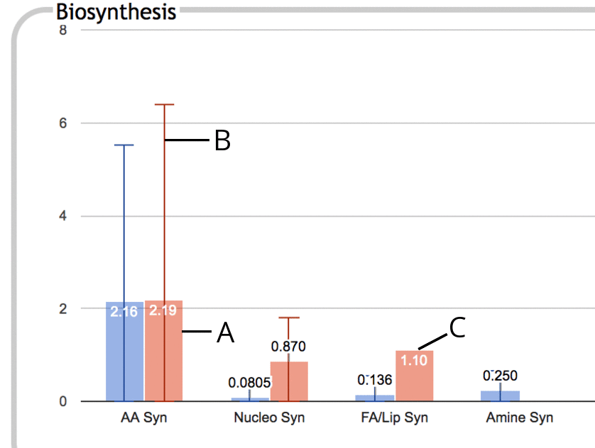
The following is an illustration of a portion of the Biosynthesis
panel in enrichment mode:
|
- The thick colored bar represents the enrichment score (-log10(p-value)) for the
entire subsystem, in this case Amino Acid Biosynthesis. This
enrichment score is the numeric value printed near the top of the bar.
- If some component subsystem has a higher enrichment score than
the subsystem as a whole, for example if Arginine Biosynthesis has a
much higher enrichment score than Amino Acid Biosynthesis as a whole
(because the enrichment score for Amino Acid Biosynthesis is diluted
by other low-scoring amino acid pathways), then this is indicated using a thin vertical line, B,
that extends past the top of the colored bar. The bar at the top of the line
represents the greatest enrichment score of any component
subsystem. This line suggests that you might want to drill down
one level in this subsystem to investigate further.
- If no line extends past the top of a colored bar, then there is
no component subsystem with a higher enrichment score than that of
the subsystem as a whole. This situation tends to happen when the contributions towards
significance are fairly evenly spread out amongst the component
subsystems rather than being primarily confined to a specific subset.
|
For each data column (experiment, timepoint or replicate group) you
wish to see an enrichment score for, you can specify a corresponding
significance column that contains significance values that you have
calculated for the data column. In the simplest case, this column
may be the same as the data column itself, such as if you simply want
to see which subsystems have an over-representation of outlier values.
Alternatively, your data file may include one or more additional
columns containing significance values (such as p-values derived from
replicate analysis). These
columns should already have been included in the file and designated
as data columns when you
uploaded it, but you will probably want to unselect them in the Data Column
Selection panel when not in enrichment mode, so they will not be
displayed as regular data series. If there is no significance column
for a given data column, you can leave it unspecified -- that data
column will be excluded from the enrichment analysis. Similarly, if
the same significance column applies to multiple data columns, assign
it to only one of them, as there is no point duplicating the analysis.
Once you have indicated which significance columns to use, you will need to
specify a significance threshold -- the enrichment computation performed by the dashboard
will include only those entities (e.g., genes) whose
significance value exceeds the threshold in the direction you specify
(p-values should be less than the specified threshold, but for
other significance measures you might want them to be greater than the
threshold).
Enrichment analysis is not available in multi-omics displays.
Visualizing Regulation
The header of most base panels includes a Show Operons button which
generates a diagram showing the organization of the genes for that
pathway or subsystem on the genome. When a database contains
transcriptional regulatory data, that too will be included in the
diagram.

|
For gene expression datasets, we can go further and see how the
expression pattern of the transcription factors that regulate a pathway or
subsystem correlates with the expression of the subsystem genes
themselves. When such regulatory data is available, the Options menu
for a base panel will include a Show/Filter Regulators command. This
command will open two insets, both of which can be manually resized,
repositioned and closed independently of each other.
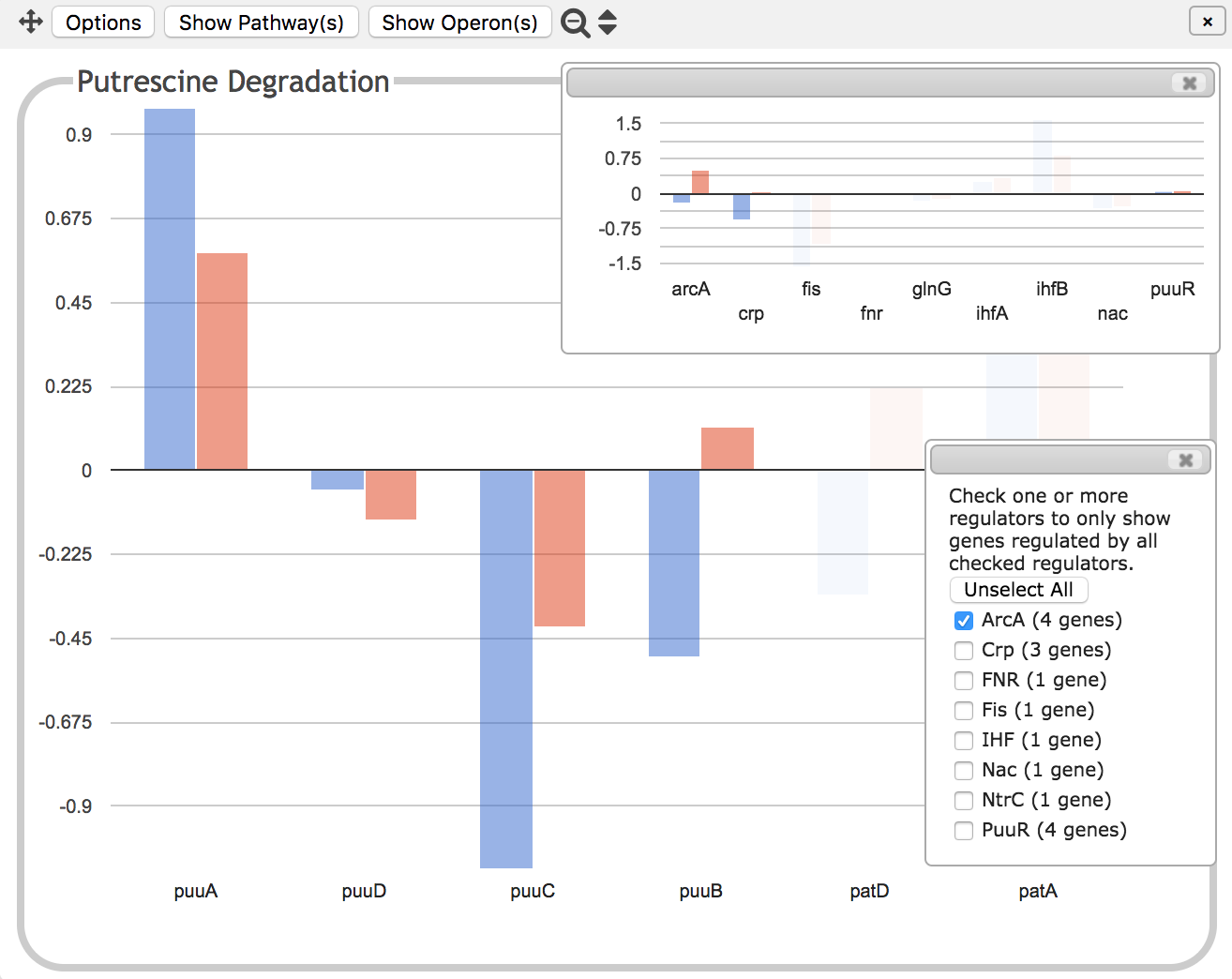
The inset shown on top in these illustrations is a graph showing the
expression levels for all of the transcription factor genes that
regulate the Putrescine Degradation pathway. There is no way to tell
from this diagram whether the transcription factors activate or
inhibit gene expression -- that information is however included in the
operon diagram described above.
The bottom inset is a set of checkboxes that allows you to filter by
transcriptional regulator. If ArcA in this example, which you are
told regulates 4 of the genes in the panel, were checked, then all but
the 4 genes it regulates would be faded out so that only those 4
genes would be clearly visible, as in the second illustration at left.
The inset showing the transcription
factor genes would then similarly hide all genes that are not involved
in the regulation of the 4 visible genes. Because one or more of
the 4 genes is also regulated by Crp, this leaves both arcA and crp visible.
If multiple regulators are checked, select whether you wish to see only those
genes that are regulated by all the checked regulators, or all genes
regulated by any of the checked regulators. The regulators for a given
gene are listed in the tooltip for that gene.
|
Customizing Panel Contents
Users can customize the dashboard to remove or reorder components of
different panels, edit subsystem names, and add new panels or panel
components, including custom lists of genes. If the user is running
Pathway Tools in desktop mode, these customizations are saved
persistently. When accessing the dashboard over the web such as from
the BioCyc website, customizations persist only for the duration of
the current session (but can be downloaded to the user's computer for
later re-upload). In either case, you can specify whether a given
customization should be applied to all datasets or only to those for
the same organism. In general, applying or removing customizations
necessitates a full dashboard page reload.
Deleting, Reordering and Editing Names of Subsystems
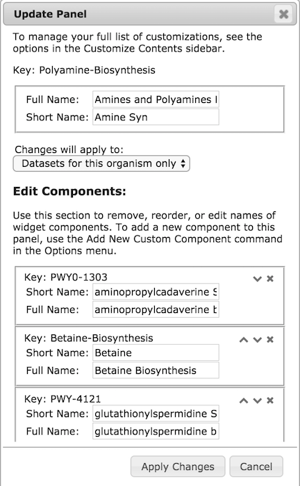
|
The Customize Panel command in the Options menu for any panel brings
up a dialog like the one at left.
Each panel has a unique identifier or key,
which usually but not always corresponds to the identifier for an object in
the database, typically a pathway, pathway class, or GO term. These
cannot be edited, but you can use this dialog to discover the key for
some subsystem in case you want to add it to a different panel. Each
panel or subsystem also has a full name and a
short name. The dedicated panel for a subsystem displays its full
name as the panel label at the top. When a subsystem is displayed as
one component of its parent panel, the short name is displayed along
the x-axis, and the full name is displayed in the corresponding
tooltip (the top-level panels, which are never displayed as components
of other panels, do not require short names). Both the short name and
the full name, both for the panel
and all its component subsystems, can be edited using this dialog.
To delete a subsystem from a panel, click the X in the box for that
subsystem. To reorder the components of a panel, use the up and down
arrows until the desired order is achieved. Note that any ordering
changes you make will only be visible if the sort option for the panel
is set to use the predefined order. There is currently no way to reorder
any of the top-level panels. Top-level panes cannot be deleted, but they can
be hidden using the Hide Panel command in the Options menu. Panels that are
hidden in this way can be restored by clicking the corresponding Show button at
the bottom of the screen.
Most base panels have their components computed automatically based on
the contents of the database. The components of these panels cannot
be edited.
|
Creating or Adding a New Subsystem
To add a new subsystem to any composite panel, use the
Add New Custom Component command in the Options menu. To add a new
top-level subsystem, use the command Add New Top-Level Panel in the
Customize Contents control panel. Both commands will bring
up a dialog like the one below.

|
There are 4 options for types of subsystems to add:
- Pathway or Pathway Class: Start typing the name of any
pathway or pathway class in the database, and select the desired
pathway from the autocomplete menu. A base subsystem will be
created (if it does not already exist) whose components are all the
genes (or metabolites) of that pathway or class.
- GO Term: Start typing a GO term identifier and select the desired
term from the autocomplete menu. A base subsystem will be
created (if it does not already exist) whose components are all
genes that are annotated to that GO term or its child or part
terms.
- Custom List of Genes (pictured left): Enter names or identifiers
of all the desired genes, and then click Search. The names of
those genes that were found will be replaced by their internal
object identifiers. Any genes that could not be found will be
listed so that you can try again to identify them.
- Composite: To create a composite subsystem, enter names or
identifiers of component pathways, pathway classes, GO terms or
other existing subsystems, and then click Search. The names of
those components that were found will be replaced by their internal
object identifiers. Any that could not be found will be
listed so that you can try again to identify them.
|
In the first two cases, the key for the subsystem is predetermined.
In the latter two cases, you must supply your own unique key. You
should also supply a full name and short name for your subsystem.
Managing Your Customizations
You can manage your customizations using the various buttons in the
Customize Contents control panel.
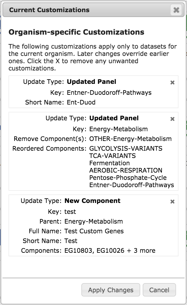
|
The View/Manage Customizations button shows you a list of all of your
customizations, as in the example illustration, left. To remove a particular
customization, click the X in its upper right corner.
To temporarily disable all your customizations without deleting them,
and to view the dashboard as it would look in its uncustomized state,
use the Show Default Display button.
To delete all your customizations and reload the uncustomized
dashboard, use the Delete User Customizations button.
To download a record of your customizations to a file on your
computer, use the Download Current Customizations to File button. To restore
those customizations to a future session, use the Upload Previously
Saved Customization File button.
If you do not have any current customizations, the only buttons you
will see in this section are those to add a new panel or to upload a
previously save customization file.
|
Exports
Any individual panel graph can be exported to a PNG image using the
command Export to PNG Image in the Options menu. The exported image
consists only of the graph itself, without the panel border and label,
or any insets. The panel as displayed, with border, label and insets,
can only be captured using a screen snapshot. For more attractive screen
snapshots, you may wish to hide the controls associated with each toplevel
panel. The Display Preferences control panel provides a checkbox for this
purpose. The entire control panel accordion can also be hidden by clicking
on the up-arrow icon in its lower right corner.
The source data for any panel graph can be displayed as a data table
via the Show Data As Table command in the Options menu. This can then
be downloaded to a csv file by clicking the download icon .
Only source data values (and group averages, where replicate groups
are created) are included in the table. There is currently no way to
generate a table containing subsystem averages, sums or enrichment scores.
The pathway and operon images are PNG files that can be saved by
right-clicking and using the appropriate browser command. Pathway diagrams
can also be exported to a Pathway Collage using the command in the
Options menu, where they can be edited and/or a higher resolution
image can be generated.
When the dashboard is invoked from a Pathway Tools web server that has
SmartTables enabled, such as BioCyc, the entire dataset can be
exported to a SmartTable using the Save Dataset as SmartTable
command in the Display Preferences control panel. A SmartTable
generated in this fashion will "remember" some display settings, such
as replicate groupings and default sort settings, so that if you later
regenerate the dashboard display directly from that SmartTable, those
settings will automatically be applied. If you wish to be able to do
this, be sure not to edit the SmartTable by adding, deleting or
reordering data columns after it has been generated.
Credits
The graphs that comprise the dashboard are implemented using the
Google Charts API. The pop-up panels are implemented using jBox.
Pathway images are generated from Pathway Tools pathway diagrams
using Cytoscape.js.
If you use the Omics Dashboard in your work, we ask that you cite the following publication:
Suzanne Paley, Karen Parker, Aaron Spaulding, Jean-Francois Tomb, Paul O'Maille, and Peter Karp.
The Omics Dashboard for interactive exploration of gene-expression data,
Nucleic Acids Research 45:12113-24 doi:10.1093/nar/gkx910 (2017)
©2017 SRI International, 333 Ravenswood Avenue, Menlo Park, CA 94025-3493.
SRI International is an independent, nonprofit corporation.